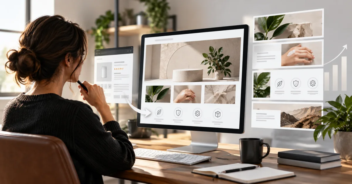
Premium A+ gives your Amazon product page more room for images, video, interactive features, and product comparisons. The tricky part is turning those options into a page that answers shoppers’ questions without making them scroll through the same point six times.
Amazon lists 19 Premium A+ module types and allows up to seven modules on a detail page. This guide covers the specs in Amazon’s Premium A+ Module Guide, version 1.0, last updated May 30, 2023. Amazon’s module list and builder can change, so check the fields shown in A+ Content Manager before your designer exports final files. Specifications, like fashion, can change without warning.
Amazon also removed the old Premium A+ prerequisites in 2026. You no longer need a Brand Story across your catalog or five approved Basic A+ projects to get started. See our update on Amazon’s Premium A+ access change.
Before you choose a module
Amazon’s guide sets these shared image rules: JPG, BMP, or PNG files; no more than 2 MB per image; at least 72 dpi; and RGB color. CMYK and animated GIFs aren’t supported. Dimensions below are minimums, in pixels, written as width × height.
Some modules use one asset across desktop and mobile. Others call for a separate mobile image, often 600 × 450. Build with the mobile crop in mind: a wide desktop image can lose its subject when squeezed into a smaller frame. Keep key product details away from the edges, and preview the page at both sizes.
Character counts are maximums. They include spaces, so leave a little room rather than writing right up to the limit. For a broader look at how A+ fits into a product page, see our guide to Amazon A+ Content.
Premium A+ modules and specs
The table groups the 19 module types by their main job. “No separate mobile asset” means Amazon’s guide says the module uses the desktop image. It doesn’t mean you can ignore the mobile preview.
| Module | Image or media specs | Text limits | Items or panels |
|---|---|---|---|
| 1. Full Image | Desktop 1464 × 600; mobile 600 × 450 | Headline 80; body 300 | One image |
| 2. Text | No image requirement listed | Headline 80; body 300 | One text block |
| 3. Background Image with Text | Desktop 1464 × 600; mobile 600 × 450 | Subheadline 40; headline 60; body 300 | Text box can sit left or right; text can be black or white |
| 4. Four Images & Text | Each image 300 × 225; desktop assets used on mobile | Subheadline 80; headline 30; body 150 | Four images |
| 5. Dual Images with Text | Each image 650 × 350; desktop assets used on mobile | Subheadline 50; headline 50; body 300 | Two images |
| 6. Single Image with Text | Image 800 × 600; desktop asset used on mobile | Subheadline 40; headline 80; body 500 | One image |
| 7. Full Video | MP4; minimum 960 × 540; maximum 200 MB and 180 seconds. Preview image 1464 × 600. Desktop assets used on mobile. | Headline 80; body 300 | One video |
| 8. Video with Text | Video and preview image 800 × 600 minimum; maximum 200 MB and 180 seconds | Subheadline 40; headline 80; body 500; video title 50; description 200 | One video |
| 9. Comparison Table 1 | Product image 200 × 225 minimum | Module headline 80; image headline 25; feature 30; tooltip 150; detail 30 | 4–7 products; 5–12 features |
| 10. Comparison Table 2 | Product image 300 × 225 minimum | Module headline 80; image headline 30; feature 30; body 80 | 2–3 products; 2–5 features |
| 11. Comparison Table 3 | Desktop image 488 × 700; mobile image 600 × 450 for each panel | Chart headline 25; image headline 25; feature 20; feature text 20 | 2–4 products; 3–7 features |
| 12. Hotspots 1 | Desktop image 1464 × 600; mobile image 600 × 450 for each hotspot | Hotspot headline 50; body 200 | 2–6 hotspots |
| 13. Hotspots 2 | Preview image 1464 × 600; mobile image 600 × 450 for each hotspot | Module headline 80; body 300; hotspot headline 50 | 2–6 hotspots |
| 14. Navigation Carousel | Desktop image 1464 × 600; mobile image 600 × 450 for each panel | Navigation text 25; subheadline 25; headline 25; body 100 | 2–5 panels |
| 15. Regimen Carousel | Desktop image 1464 × 600; mobile image 600 × 450 for each panel | Module headline 100; inset headline 20; inset body 100; navigation text 20 | 2–5 panels |
| 16. Simple Image Carousel | Desktop image 1464 × 600; mobile image 600 × 450 for each panel | Headline 50; body 200 | 2–6 panels |
| 17. Video Image Carousel | Video MP4; minimum 800 × 600; maximum 200 MB and 180 seconds. Image 800 × 600 minimum. Desktop assets used on mobile. | Headline 80; panel headline 50; panel subheadline 80; panel body 500; video title 50; description 200 | 2–6 panels |
| 18. Q&A | Image 1464 × 600 minimum; desktop asset used on mobile | Question 120; answer 250 | 2–5 questions and answers |
| 19. Technical Specifications | No image dimensions listed; same layout for desktop and mobile | Headline 80; specification label 30; definition 500 | 4–16 specifications |
How to pick the right modules
Lead with the buyer’s question. A full image can set the scene; a short video can show how a product moves or gets assembled. Hotspots work when the product has parts or features that need explaining. A specification module is a cleaner place for measurements than a paragraph that reads like a packing slip.
Use comparisons when the differences matter. Comparison tables can help shoppers choose among products in your catalog. Put real distinctions in the rows: size, materials, included pieces, or intended use. If every column says “premium quality,” the table is mostly decoration.
Give each panel a reason to exist. Carousels and four-image modules work when each image adds a new view, use, feature, or step. If the third panel repeats the first with a slightly different background, it may be time to retire it.
Keep video focused. A video can show scale, operation, or setup more clearly than a still image. Start with the moment that answers the buyer’s question, not a long logo animation. Amazon’s guide allows videos up to 180 seconds; that’s a limit, not a target.
Build the page, then check it on mobile
Start with the information a shopper needs to decide, then choose the smallest set of modules that explains it. Draft copy to the character limits, prepare separate mobile images where required, and preview the full page in A+ Content Manager before submitting. Also review Amazon’s current image guidance and your module fields in the builder, especially if you’re reusing a file prepared from an older template.
For help planning the visuals that sit alongside A+, see our Amazon image stack guide. Tell Parker-Lambert about your brand and ask about a custom quote for your project: schedule a free call.